The latest version of the globally renowned CMS, PrestaShop is available for use. PrestaShop 9 comes with loads of enhancements focussed on frontend,
Read More“You don’t just need a website, but one that sells!”
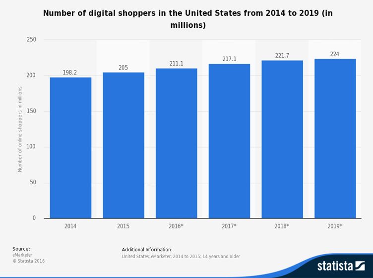
In 2018, online sales revenue hit approximately $504.6 billion in the US. Projected to surpass 735 billion US dollars in 2023, the eCommerce industry is on a drastic hike. With this, the number of online shoppers is bound to rise – in fact, has been rising for the last 5 years.
Thus, indubitably it is the right time to invest in an eCommerce store and become a part of this rapidly-evolving industry; and why shouldn’t you? The internet is a shopper’s paradise. From the comfort of the home and with one click, a consumer can purchase anything they desire, without the hassle of fighting traffic, parking, braving the crowds and adverse weather.
To beat the curve and join the ranks of the high-flying eCommerce stores, you need to provide consumers with a well-organized and efficient online shopping experience.
The first and foremost part that needs to be taken care of is the web design of your online store. Regardless of the eCommerce platform, your plan, dreams and success can be turned into mere trash with wrong web design. The importance of web design can be traced with the study revealed by Kinesis Inc. which stated that users form an opinion about your website in the first 0.05 seconds. Yes, you read that right.

A whopping 0.05 seconds are all that can either make business or break business.
Undoubtedly, content is king, but 0.05 seconds is just too less to even notice that. What catches the users’ eye is the web design, interface and experience your eCommerce store provides. When the designers entail the best web design practices, your website stands a good chance of competing with the rivals that are barely one ‘click’ away.
Let’s help you with some of those practices.
Easy and Simple
Users visit your site for one reason and you want to help them get there as quickly as possible. The more clutter on your web page, the more likely visitors will deviate.
You can achieve this by avoiding unnecessary multimedia content like videos and graphics that don’t have a clear function. Undoubtedly, videos are a great way to attract customers but overloading them might land you in trouble. Furthermore, avoid cluttering with too many products – instead make use of clear, well-segmented product categories pages.
With a simple and uncomplicated design structure, you can convince plenty of users to surf through your site and engage in seamless shopping.
Call-To-Action and Sign-Up Forms
Once the customers are all set with your products and services – all thanks to simple design – How should you take him further? Or how do you insist him in making the purchase?
Well, you need to place some unique call-to-action buttons that can grab the users’ attention immediately. These buttons should display such features or attributes that trigger checkout.
In addition to this, make sure that the sign-up forms are short and concise – where the user needs to enter the e-mail id, contact number and set a password. It is unnecessary to drag the sign-up forms by asking for address, occupation, etc.
As per kissmetrics, 23% of the users will not think twice about abandoning their shopping cart if they are asked to sign up at the time of checkout! It is highly recommended to keep it as simple as possible, and/or offer the facility of a guest account. This way the customer can make a quick purchase rather than been stuck for long and drop the idea of shopping.
Integrate Breadcrumb Navigation
In order to keep the user glued to your site, you should definitely opt for breadcrumb navigation. This means that the user should be able to view all the pages needed to be navigated for the entire payment process. Without this, the customer might ditch the thought of purchasing any product in the mid-way, since, he has no idea about the remaining process. The user might get a misconception that your store stretches the payment process.
Furthermore, breadcrumb navigation allows the user to jump back to a certain page, in case any entries have been missed or done wrong.
Though these are just some of the practices, at the same time enough for a successful eCommerce store/website. Integrating these might help you in the long run – provided you choose the right platform and designer.
In order to bring out the best, choose from the topmost development companies or hire certified PrestaShop developers. Furthermore, after achieving your desired store, you can enhance your business productivity with the help of online store management apps.
Until Next Time!
If you want a free audit of your Prestashop project click here
The latest version of the globally renowned CMS, PrestaShop is available for use. PrestaShop 9 comes with loads of enhancements focussed on frontend,
Read More